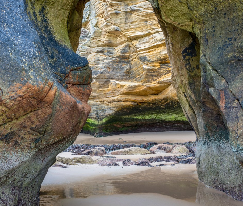

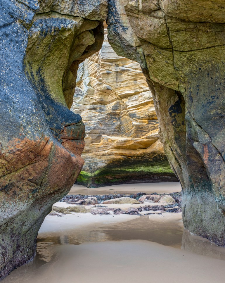
To crop or not to crop that is the question, I liked the original image from a previous visit and decided to retake it – the image sat in my edited folder and then I decided to revisit it this time cropping much tighter. You lose some focus and the context by cropping but you also highlight the clash of textures and colour – so was I right to crop – that is the question…

Such beautiful colours and shapes!
Amazing place to be.
Many thanks, Cornell – this nature destroying or evolving depending on your perspective.
Lovely textures. I like both, but there is more life in the uncropped photo.
Love them both!
Glad – David what a response for the infrequent blogger 🙂
I actually like them both. The cropped version for the added texture and color, but the uncropped version added some interest with the shapes of the rock closest to you (esp. the upper left corner).
A perfect assessment – which summarises the split opinion – which personally I love – may subjectivity promote loads of photographs for us all to view and be inspired by.
Like cristi, I prefer the crop! And yet, Scott, with a second viewing the original seems to entice me to enter… So… both have their individual beauty! 🙂
I’m sitting on the proverbial fence… 😉 😉
the fence is not like you – that said I have really enjoyed the process and concluded – I need blogging loads – I have had a period of low productivity – but the snowdrops are out so – lots of pictures me thinks.
Personally, I prefer the uncropped version, I find it more interesting with the dramatic shape the two rock formations produce by joining at the top. It also gives the image depth. That’s just me though. I totally get what you are saying about re-focusing the viewer on the different rock textures and colours by cropping, and it almost turns it into an abstract. It is purely personal preference, tbh.
What a great set of responses – pretty much split on the crop. Depth was also mentioned by Alexander – I agree – the crop turns it into more of an abstract with three distinct sections. In the end all subjective – but I do want to revisit my approaches as I grow. I have found so much more in images – that I edited 3/4 years ago – that they still have worth in revisiting…
Love the textures.
I prefer the composition uncropped one.
For the cropped one – my suggestion would be to crop the bottom a little higher up into the water to eliminate the light coloured sand at the bottom of the frame.
Just my 2 cents worth. (is that an expression you guys have in Scotland?)
Neil many thanks your 2 cents worth is appreciated – I understand where you are going with the crop – but I really liked the wet sand reflection and wanted some of the dry sand to emphasise that element. I’m also going to mess around with some dark n moody mono edits.
Great colors! I like the uncropped….the dynamics of completion at the top…and even more textures.
I hear exactly what you are saying – interestingly this was a flat light and dry day – I think well worth revisiting on a bright wet day – for real drama
Original one is better for me. The cropped one is looking flat, there is no 3D feeling.
Thanks, Alexander – I tend to agree with you – intrigued how split the feedback is – depth is missing in the crop – effectively becoming more of an abstract.
Crop or not….doesn’t matter as you have more than one good image. Ain’t half bad! 🙂
I would never have published something like this in the past. I think I will have a focus period on the Moray Coast and get down and gritty with my own locale. Definitely more aerial coming – methinks
They were two images anyone would be proud of….may be you should stay at home more and head down to the shore. Have fun ….forget the drone they are getting ‘too common’ 🙂
Scott, you captured the essence of texture and nature’s beauty very well. I would love to visit this place. After study each image, I like the original a bit better, as it provides more of a frame for your photograph. Very nice!
Michael great feedback – it is an amazing coast which I am sure you would enjoy. This beach is only a few miles down from the golden sands of Lossiemouth but is all eroded sandstone caves and wild rock formations – in a few hundred years it will have all gone and reshaped itself into it next shape.
Both beautiful but I agree with you, the crop is more striking.
Interesting such a split response – just shows you how image appreciation is so subjective.
I like the crop. Beautiful photo!
Many thanks – it is a beautiful coastline